William Morris Surfs the Superstore
Source
'William Morris surfs the superstore' Object 1:99, pp 21-25 (1999)
The Centenary of Federation provides an opportunity to trace contemporary Australia back to the plans of our forbears. Contemporary craft has a similar journey to make, back to the authors of the late nineteenth-century Arts & Craft Movement. William Morris and John Ruskin envisaged a world in which the broad mass of people would share in the enjoyment of creative labour. How far are we from that world today?
The time is auspicious for such a pilgrimage. English cultures tend to oscillate between aristocratic and popular movements. This taste shift is evident in numerous oppositions, such as exotic/ordinary, cool/warm, Norman/Anglo, Catholic/Protestant, and cats/dogs. We witness it today in the criticism of decadent postmodernism. In the crafts, this reaction is exemplified in the writing of Peter Timms, who claimed recently that ‘craft theory’ has taken the ‘high ground of the academy and commodity capitalism’. This path of this article follows Timms before heading in its own direction.
There are three paths leading us back to William Morris and his factory in Hammersmith. The most well-worn takes us via the cluster of handicrafts that we inherited from the Arts & Craft movement. This traditional core offers a familiar focus for craft fundamentalism. While in philosophy, the recurrent call is ‘back to the things themselves’, in the crafts these ‘things’ take the form of hand-operated equipment—‘back to the loom’, ‘back to the bench’, or ‘back to the furnace’. Today this reaction is given additional bite when set against the increasingly abstract manipulations that workers now make on their desktops. As an act of counter-modernism, this conservatism is quite bold. Though without due consideration, it can be easily packaged as nostalgia for tourists.
The second route bypasses the handicrafts entirely and looks for an equivalent dialectic in our own time. Today, it is not the culture of the hand-made which is threatened, but the operation of the very machines that were once their antithesis. Our dissident sentiment today finds a suitable target in the disappearing mechanical trades, such as off-set printing, stenography, tape editing and darkroom processing. Today’s craft world should consider taking in this new generation of refugees on its doorstep. For current purposes, however, this path has been mapped elsewhere and there are less chartered territories ahead.
The final trajectory takes us away from the galleries and unites us with the broad mass of people, some of whom appear to be heading in the right direction. This freeway of mainstream culture is the route favoured by Timms, who identifies factories such as Nicholas Dattner as closer to the spirit of Morris than most ‘contemporary’ craft. To take anti-elitism further, I propose to avoid this light industrial ‘turn off’, and stay with the mainstream until we reach the epicentre of our culture—supermarkets, malls and shopping centres. Will this mainstream lead us back to the wholesome energies of creative labour, participation and expression?
Keyboard: machines
We start with a familiar point of reference. The Melbourne jeweller Roseanne Bartley could almost have been dreamt up by William Morris. Bartley’s method is to rummage through expired items of utility, such as shaving brushes, hair curlers, tap tops and spanners. She rescues these from the bottom of drawers and transforms them into top shelf items.
Her most recent work gives new purpose to a redundant generation of typewriters. Her rings, pins, cuff links and necklaces provide an elegant setting for these otherwise unwanted keys. Besides her practical skills, Bartley contributes a botanical imagination to her recuperative project. In her objects, keys come together to spell words like ‘ivy’, ‘acorn’, ‘pod’, ‘rose, ‘wilt’ and ‘lotus’. These allusions reverse the traditional sense of machines as inhuman devices.
Besides making objects, Roseanne Bartley carries a broader responsibility to keep alive the lost world of manual keying. She is known affectionately around Melbourne’s markets as the ‘typewriter lady’ and her exhibitions feature typewriters where visitors can recall the clunking rhythms by typing a sentence for themselves—sentences which are sometimes incorporated into future pieces. Bartley’s work combines creative care with the everyday world of practical action.
The other side of the coin to typewriter jewellery is the keyboard mayhem of ‘shoot-em up’ computer games. A game like Quake combines violence with the melodrama of gang warfare. Quake is celebrated for its vivid graphics—quick changes of scene and lurid pixels that ooze out of murdered opponents. Reaction time is critical. It is a highly focused experience that engages only a few keys of the computer.
Yet even a destructive pastime like Quake has developed its own craft-like ecology. There is a host of communities where dedicated players can share individually written scenarios with each other. There are even guilds of Quake programmers who run servers for the use of fellow gamers. Once inside one of these guilds, though, it is difficult to mistake the violent tenor.
An opposition employed by Louis Mumford helps contrast these two uses of keyboard. Quake corresponds to the ethos of the ‘hunter’, for whom the world is a field of action with which there is no reciprocity. By contrast, Bartley’s keyboard jewellery is for the ‘herdsmen’ who must nurture the field from which they gather. We continue with the jalopies, puttering along the well-paved highway, going against the flow of speedsters tearing along pot-holed roads.
Dartboard: pubs
 On
our way towards the centre, we reach a point where suburbs meet city—the
inner-suburban pub. A large proportion of Object contributors and
readers probably inhabit the inner suburbs of Australian capitals, and
have regular neighbourhood bars to retreat for a drink at night. Many
of these bars were once working men’s pubs, which by the end of their
lives were sad desolate places, haunted by chain-smoking alcoholics served
stale beers by part-time staff in lingerie.
On
our way towards the centre, we reach a point where suburbs meet city—the
inner-suburban pub. A large proportion of Object contributors and
readers probably inhabit the inner suburbs of Australian capitals, and
have regular neighbourhood bars to retreat for a drink at night. Many
of these bars were once working men’s pubs, which by the end of their
lives were sad desolate places, haunted by chain-smoking alcoholics served
stale beers by part-time staff in lingerie.
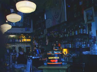
After nearly a decade of residence, the incoming Fitzroy generation has developed its own particular vintage of ‘grunge hermitage’ available for tasting at its many corner bars. The Builders Arms Hotel, for instance, used to be a notoriously violent establishment, with a history of fights and occasional murders. Seven years ago it was taken over by a group of friends who managed to tame the atmosphere down until it felt as comfortable as a lounge room. Patrons recline in lounge chairs and admire shelves laden with bric-à-brac. Depending on the night of the week, the hotel offers patrons entertainments such as board games, live music, nostalgia films, poetry readings and retro-80s dance music. In defiance of the gambling industry, the pub sports an anti-gambling neon sign on its façade.
Closer to the city centre is another new generation of drinking places—the ‘Irish Pub’. In Australia, these bars have corny names like Irish Murphy’s, Sruffy Murphy’s and Paddy O’Brien’s. The most successful, Bridie O’Reilly’s, was named after the dog of its Perth founder, Maurice Brockwell. There are currently eight Bridie O’Reilly’s clones in Australia, as well as a couple of theme English pubs called The Elephant and Whistle.
Bridie O’Reilly’s offers 21 beers on tap, live Irish singing, Celtic décor, and a supermarket-style scanning system for taking customer orders. The menu offers ‘ALL DAY Irish breakfast (with all the trimmings), plus Pasta, Fish 'n' Chips, Steak sandwiches and loads of daily specials!’ Such pubs serve their customers the cream of a deep cultural tradition, without any of its obligations, nor its responsibilities.
Like McDonalds Family Restaurants, Irish pubs can now be found anywhere in the world. Though their names suggest individual ownership, you are as likely to meet their owner across the bar as find Colonel Saunders at a KFC counter. By contrast Fitzroy pubs celebrate the eccentric taste of their proprietors.
Side-board: magazines
‘Branding’ is a new extension of American capitalism. Names like Calvin Klein, Ralph Lauren, Tommy Hilfinger, Georgio Armani and Elle McPherson add value to a variety of products. So pervasive is the branding phenomenon that it has even become a private religion. The movement titled ‘The Brand Called You’ inspires ordinary Americans to think of themselves each as a brand unto themselves. The voyage of self-discovery takes you to the unique product that might become ‘the brand called you’. ‘Calvinism’ is no longer about the work ethic—it’s the name on the clothes you wear.
Are there brands that we can admire, regardless of their commercialism? In terms of craft, we might consider the merchandise of Martha Stewart as worthy of attention. Martha Stewart began with books on entertaining, before publishing her magazine, Martha Stewart Living. Her business has since extended to regular television and radio appearances, web chats and merchandising (Martha by Mail).
What distinguishes Martha Stewart Living from other ‘shelter’ magazines such as Home Beautiful, House & Garden, and Vogue Living is a Puritan work ethic. It offers advice on quite practical everyday tasks. The thanksgiving issue of Martha Stewart Living includes advice on how to bake the perfect pie crust, make chutney gifts, keep a bloom closet, shine pots, use trivets, choose the right fastener and acquire penmanship. While most issues include a feature on a contemporary craftsperson, the emphasis is predominantly do-it-yourself.
By contrast with Australian magazines, such as Burke’s Backyard, Martha Stewart Living is quintessentially elitist. As such, she represents a peculiar realignment of capital in our world where time, rather than money, has become a symbol of wealth. The Martha Stewart way is often mocked for upholding impossible standards of house maintenance. While other lifestyle magazines might allow readers a glimpse of the fabulous wealth of their subjects, Stewart offers vicarious enjoyment of her lifestyle. She feeds this criticism with a running diary of her month, like this list for October:
Pile up leaves and compost them
Daylight Savings Time ends; turn clocks back
Clean out gutters
8:38 a.m. CBS ‘This Morning’ appearance
Give trees first dormant oil spray
Carve pumpkin lanterns
Make candy apples for trick-or-treaters
The nemesis of Martha Stewart is Dilbert. This cartoon office worker also has a merchandising empire, though its goods are for desktop rather than domestic consumption. Whereas Martha Stewart valorises creative labour, Dilbert celebrates sloth. It provides a staple in the diet of office workers—the mental Mars Bar that leavens the unceasing load of routine tasks. Through its daily cartoon, Dilbert delivers a regular dose of slave humour about incompetent masters.
In a typical strip, Dilbert’s boss comes into his cubicle saying there’s a problem with the direction signs for an upcoming conference: the arrows point to the right, whereas the conference is located on the left. After Dilbert sarcastically confects a plan to accommodate the wrong signs by relocating the conference to the middle of a lake and build a deep platform hotel by tomorrow, the boss accidentally notices that simply turning them over can reverse the arrows. ‘Spooky’, he mutters to himself.
While their managers are reading Martha Stewart on the joys of making wreaths, cubicle slaves are snacking on such cartoons that depict their bosses as idiots. The core victim of Dilbert humour are those who consider themselves ‘induhviduals’— workers that attempt to stand outside the system. Dilbert implies readers who have accommodated themselves to being little more than routers on networks. In their world, both William Morris and Martha Stewart would be merely self-important ‘induhviduals’.
Surfboard: clothes
 Are
there any notable Australian brands? Yes, but rarely with individual proper
names. A popular Australian brand close in spirit to the arts and craft
movement is Mambo. According to legend, the company was founded
in a Punchbowl beer garden back in 1985. Today, Mambo has stores
opening in Tokyo, Paris and even Melbourne. Its position in Australian
decorative arts has also been consolidated by the release of a heavy-duty
hardcover art book: Still Life with Franchise.
Are
there any notable Australian brands? Yes, but rarely with individual proper
names. A popular Australian brand close in spirit to the arts and craft
movement is Mambo. According to legend, the company was founded
in a Punchbowl beer garden back in 1985. Today, Mambo has stores
opening in Tokyo, Paris and even Melbourne. Its position in Australian
decorative arts has also been consolidated by the release of a heavy-duty
hardcover art book: Still Life with Franchise.
A key figure in Mambo is Reg Mombasa, guitarist with Mental as Anything. His suburban surrealism invigorates the otherwise bleak landscape of Sydney’s west by introducing unlikely elements of high culture. The ‘Australian Jesus’ series blesses the realm of quarter-acre blocks with sacred significance. In Mombasa’s universe, ‘Australian Jesus drives a late model V8 Commodore Ute because he needs a powerful vehicle to ferry his tools and biblical accessories.’
 Mambo
proverbs such as ‘the grass is always greener around the tap’
exemplify this carnivalesque theme. It combines a simple universal code
(‘the grass is always greener on the other side’) with a parochial
element—the suburban backyard and its ubiquitous outdoor tap. It
is not the kind of proverb that translates easily across cultures, which
is what makes it effective as a celebration of local knowledge.
Mambo
proverbs such as ‘the grass is always greener around the tap’
exemplify this carnivalesque theme. It combines a simple universal code
(‘the grass is always greener on the other side’) with a parochial
element—the suburban backyard and its ubiquitous outdoor tap. It
is not the kind of proverb that translates easily across cultures, which
is what makes it effective as a celebration of local knowledge.
What craftspersons might find most appealing about Mambo is its creative culture. Their productions are not limited to ‘loud shirts’, but also include crafts and multimedia. The jewellery line points to otherwise overlooked possibilities, such as wallet chains for skateboarder clientele. Their design for the CD-ROM Real Wild Child helped make it one of the outstanding successes of Australian multimedia. And they extend their label to other artists with an interest in the suburbs, such as pop artist Maria Kosic and pop ceramicist Gerry Wedd. This openness, however, does not extend its thematic basis beyond parody and scatological humour.
The antithesis of Mambo is Nike. As suggested by their slogan—‘just do it’—Nike is about action. When you are training for the top, there is no time to reflect on the colours of grass in the backyard. The stars are elsewhere.
Nike supports the cult of elite sports. Its extreme idolatry reaches apotheosis in the elite of the elite—Michael Jordan. As a ‘Brand Jordan’ poster describes him:
A rare phenomenon; it happens maybe once in a century. Once in your life. An athlete transcends time and space. Sparks our sense of wonder with masterpiece moves. Clutch performances. The absolute pinnacle of perfection. Like some superb meteor in magnificent glow, eclipsing all that was, he quickens the very soul of the game.
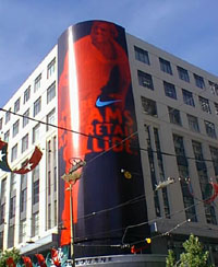 In
the wake of such gods, all that is left for mortals to do is train.
By wearing the sacred symbol, our training can have some connection with
the ideal world of super-athletes. Outside the Nike superstore
in Melbourne, a five-storey high poster of Shane Warne proclaims ‘where
dreams and retail collide’.
In
the wake of such gods, all that is left for mortals to do is train.
By wearing the sacred symbol, our training can have some connection with
the ideal world of super-athletes. Outside the Nike superstore
in Melbourne, a five-storey high poster of Shane Warne proclaims ‘where
dreams and retail collide’.
By contrast with democratic brands like Mambo, Nike is all about raising yourself above others, both literally and metaphorically. Rather than surfing, the core sport is basketball, a sport that comes to its climax as men reach for hoop, hanging in the air in defiance of gravity. The ‘tick’ logo emphasises this upward leap, made possible by the mystery air cushions in the soles. By contrast, various kinds of surf- and skateboarding pursue the horizontal; they are about individual deviation rather than teamwork, and freedom rather than winning.
As a corporate presence, Nike is known for the uniformity of its image. The unchanging tick is evident everywhere—on caps, t-shirts, boots and bags. While Nike is strictly orthodox about its symbol, Mambo celebrates its heterogenous label,
Mambo doesn’t have a single logo. What we have is a short attention span and a tendency to get bored with artwork that’s more than six months old. As a result, we are continually designing new logos for the amusement and stimulation of both our customers and ourselves.
Mambo is arguably an antipodean version of Morris & Co—perhaps lacking its dignity, but certainly more open to the creative spirit than the monolith of Nike.
Below board: drinks
Finally, we come to the ultimate destination of all freeways—the billboard. An advertisement has two teenage boys sitting on different boughs of a tree. One is drinking Coca-Cola, the other Pepsi. The advertisement takes us into the dreams of each. The Coke boy dreams of hitting a winning six in a cricket match, mobbed by cheering fans and players who are grateful that his contribution helped save the team. The Pepsi boy, however, solicits a different kind of crowd. The boy in a white coat confronts a waiting room filled with scantily-clad girls. He ushers one through his office door, the sign on which reads ‘Bikini Waxing’. Without any overt statement, the advertisement makes it clear that the Pepsi drinker wins in savvy. The Coke drinker is still captive to the adulation of others—beholden to old-fashioned sports like cricket—whereas the Pepsi dude has the cunning to simply gather what pleasure he can.
The Pepsi ad works only through collusion with the viewer. If one of our early fathers, such as William Morris, were to be viewing this ad, what would he be drinking? My guess would Coke, thinking that it is better to be actively making your destiny in the clear light of the public, rather than winning illicit delights, Clinton-style, with the perks of office.
By the end, we find ourselves somewhere in the vicinity of Hammersmith, though there’s still some doubt whether it’s the real place or an arts & craft theme park. Our navigation has been guided more by than the direction of onward traffic—heading to the passive delights of global capitalism—than the progress towards a culture of popular creative labour. But at least the direction is two-way—not all roads lead to Planet Hollywood.
This article was published in Object magazine (1/99) and was made possible by an Australia Council grant.


Copyright held by author Kevin Murray
For permission to reproduce this article, please contact Kevin
Murray